Before you can change the world, before your company can IPO, before getting millions of loyal users to wonder how they ever lived without your service, people need to onboard through an effective user onboarding process. Building the on-ramp to using your product is critical in every industry, but few more so than in the ADD world of web and mobile apps. Distractions are everywhere, vying for user mindshare and threatening to pull them off the road to using your products like the donut shops and strip clubs at a trucker’s rest stop.
However, done correctly, the user onboarding process can be the first step in creating strong user habits. Products that create repeat behaviors tend to follow a consistent design pattern of a trigger, action, reward, and investment (see: Hooked Model). This pattern is effective when used to craft behaviors that the designer intends to be repeated regularly. The user onboarding process can be the first of several passes through the Hooked Model.
Pulling the Trigger
The first step is bringing users in. But a successful trigger is much more than just a way to drive traffic, it’s an opportunity to start imprinting new routines. Josh Elman, an early product manager at a string of successful companies, including LinkedIn, Facebook, and Twitter, describes this as the point of “inception”– yes, like the movie. “Inception is about implanting an idea about why and when the product is useful for someone.” Since a user’s first awareness of a product depends on an external trigger, such as a call-to-action in an email, a link on a social media site, paid advertising, or a word-of-mouth recommendation, the message must be consistent. “People need to talk about your product the same way, each and every time,” Elman says.
To be most effective, the articulation of what the product is for should connect to when the product should be used. In other words, inception is about attaching your product to a moment in the user’s life.
Instagram does a particularly good job of inception during their user onboarding process. Well before registration, Instagram triggers new users from within the Facebook newsfeed and communicates that the service is for capturing and sharing important moments through better photos.


When new users follow the link to the Instagram homepage, they learn more about what the service is for by seeing how their friends have used it. In just two clicks, the service effectively brings users in and teaches them what the product is for.
Of course, not all triggers are created equal. The best triggers are those that attach to frequent behaviors. Attaching a new action to a current behavior is much easier than attempting to create a new set of actions from thin air. Habits are like the layers of a pearl. The grain of sand at the center is the pre-existing behavior, which provides the base for new routines to attach to. Through its triggers, Instagram builds upon the existing routine of taking pictures on mobile devices. In the process, they habituate users to choose Instagram instead of the phone’s native camera app.
Prompting the Action
After the trigger has conveyed what the product is for, the next step in the user onboarding process is getting the user to take the intended actions. Research by Dr. BJ Fogg at Stanford’s Persuasive Technology Lab indicates that reducing the effort involved in completing an action increases the likelihood of that behavior. Simplifying the experience is key. However, this is often easier said than done, especially when it’s not clear what users find most valuable about the still nascent product.
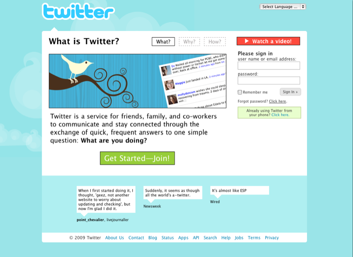
Take Twitter, for example. Today, the company is revered for its elegant user interface. But it wasn’t always that way. In 2009, Twitter’s sign-up page was a mess of cognitive distraction. Back then, the homepage communicated that the product was for “staying connected through…answers to one simple question: What are you doing?”
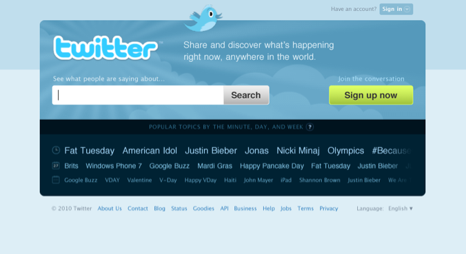
By 2010, the sign-up page shifted to a much simpler design. It became clearer what the company intended vistors to do — either sign-up or search — but unfortunately, this wasn’t quite right either.
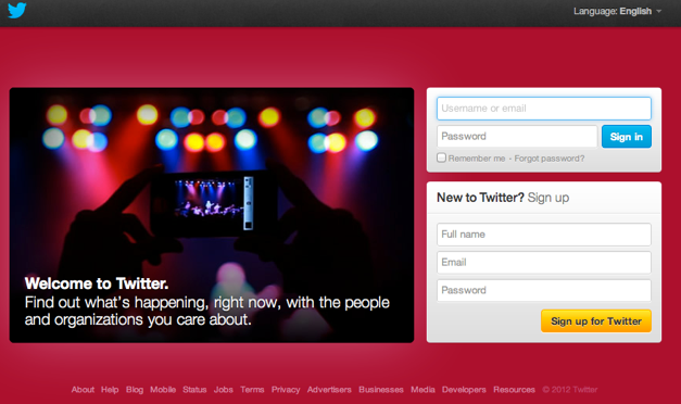
Today, after years of iteration, the registration screen is down to its fundamental elements. The design has reduced the friction of getting users to take the intended action, namely logging-in or signing-up.
Gimme the Reward
Next, it’s time to give users some love for using your service. They understand what the service is for and they’ve taken the first step to use it. Now effective user onboarding entices them with goodies to make their dopamine receptors want more.
Research on the importance of reward systems dates back to Waston, Pavlov, and Skinner and remains a pillar of how humans learn. Behavioral Psychology explains how the drive for rewards is motivated by an endless search for stimulus, either external or internally derived.
Among the most powerful methods for increasing the probability of a behavior is providing rewards on a variable ratio. In other words, when the behavior produces varying amounts of benefit, the user increases the action. Variable rewards can be found at the core of all sorts of addictive behaviors. The fact that so many of these behaviors are illegal is a testament to the power of this particular type of reinforcement.
But, used judiciously, variable rewards can be used to keep users engaged, pique their interest, and motivate them to commit further to using the service. Anticipation drives the search for rewards and it is this endless hunt that keeps users engaged.
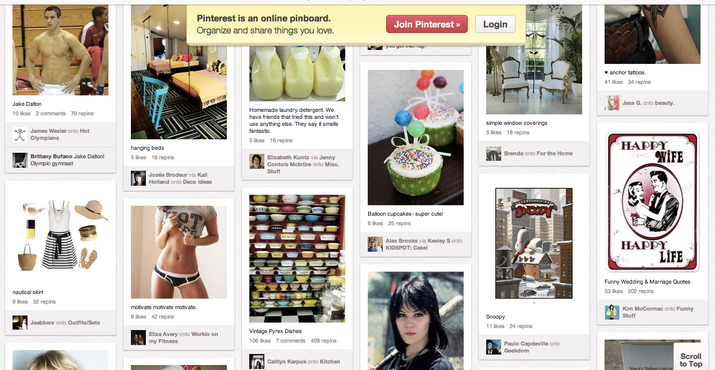
Companies that can entice users with variable rewards stand a good chance of seeing their users convert into regulars. Interestingly, powerful variable rewards systems used by some of Silicon Valley’s hottest companies don’t fit the mold of what most people think of as a method synonymous with slot machines. Pinterest, for example uses a more subtle, yet powerful variable rewards mechanic in their home page.

The eclectic mix of eye-candy stimulates viewers with a smorgasbord of endless cognitive delights. Images of food, kids, half-naked bodies, and artifacts of status entice users to keep scrolling and scrolling, endlessly searching for the next interesting thing sure to await just beyond the fold. It’s when users have fallen in love with the site — and the way the site makes them feel — that they are ready to join Pinterest and become registered users.
Investing for the Future
Many companies are afraid to ask the user to do work. They follow the mantra that good design should get out of the user’s way, but they often take it too far and forget that asking the user to do some work can be a very good thing. In fact, exerting effort makes people value outcomes more highly. A study at Harvard identified the “IKEA effect,” which demonstrated that “labor alone can be sufficient to induce greater liking for the fruits of one’s labor.”
This principle applies to building apps as much as building furniture with unpronounceable Nordic names. Too often, companies miss an opportunity to build the user’s commitment to the product by not asking for a little effort at the right time.
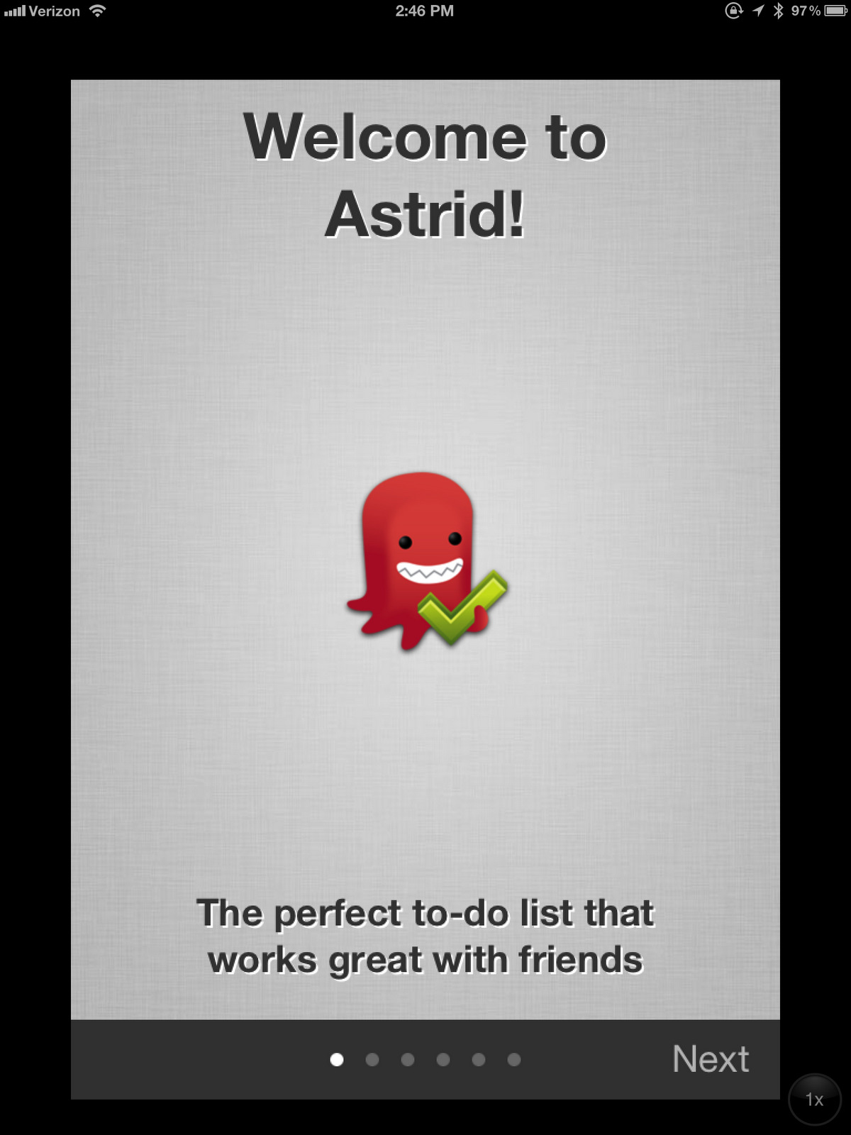
As a case study, take a look at the user onboarding process of two productivity apps, Astrid and Any.do, both designed to help people get stuff done. Astrid guides the user through several screens of bullet navigation. The often-used design pattern employs a nifty cognitive trick to parse out multistep tasks into bite-sized chunks, which users have an easier time completing. In theory, for effective user onboarding, the user simply has to flick through the screens.
But perhaps the process is too easy. How much does the user actually retain when the incentive is to quickly swipe through to see what happens next? Users bypass comprehending the tiny text intended to teach them how to use the app. Though I love the service and the company was gracious enough to allow me to use it as a case study, they could do better by strategically asking the user to do some work in the user onboarding process. Doing so would earn commitment with every bit of effort the user invests in the product.
As a counter-point, take a look at how much more effort Any.do demands of its users during its user onboarding process. With Any.do, users need to effectively use the app in order to understand how it works. They need to actually do what the tasks tell them to do. “Swipe to the right to complete a task” the app demands to make the default task disappear. This is clearly more work than the Astrid user onboarding process, but it’s a better implementation.
User Onboarding and Beyond
The four step pattern applied to user onboarding describes one example of how the trigger, action, reward, and investment framework can be used to form user habits. The strength of combining these four stages is best utilized to create behaviors the designer of the app or website expects to see regularly. Clearly, steps in the user onboarding process that are done once and never done again do not benefit from this pattern.
However, for services whose business models depend on consistent usage, effectively applying the Hooked Model can mean the difference between a hit or a flop. Implementing these steps in the user onboarding process takes advantage of a critical point when the user is most motivated and ready to learn how to use the service. The user’s receptive state doesn’t last long, and research suggests that the designer has literally milliseconds to get the user started down the right path. Use the opportunity wisely by creating an effective user onboarding process.
Thanks to Josh Elman, Jules Maltz, and Max Ogles for reading early versions of this essay.
Photo Credit: gbaku
Related Articles
- Schedule Maker: a Google Sheet to Plan Your Week
- Cancel the New York Times? Good Luck Battling “Dark Patterns”
- How to Start a Career in Behavioral Design
- A Free Course on User Behavior
- User Investment: Make Your Users Do the Work
- Variable Rewards: Want To Hook Users? Drive Them Crazy
- The Hooked Model: How to Manufacture Desire in 4 Steps